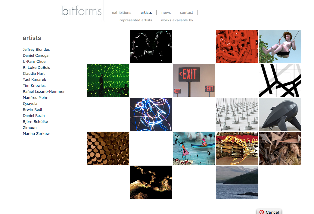
I came across a post dissecting some gallery designs at AFC’s Best Dressed List which I think is worth reading. Personally Bitforms has one of my favorite gallery designs. Many gallery websites that I look at either use very slow-loading and unneccessary flash or else look homey and unprofessional
“The outstanding feature of the Bitform’s website is their display of images. One of the most common design flaws on the websites I have visited is that the frames have been designed to fit medium size images (a good example of this can be found on the Caren Golden Gallery website). This is a problem since a large sized image is always desirable. One of the things I love about all of the sites I am discussing today, but in particular Bitform’s, is that the large image size they provide on their site is at least 400 pixels in height or width.”
For further information on beautiful website design check out:
Technorati Tags: art, artist web design

