Many of you may know that we started our sister Business, Beautiful Artist Websites, back in 2005 because we were tired of seeing so many really badly designed artist websites.
Times have changed and there are more good-looking artist websites online than there were back then, but the reality is that many are still poorly presented and don’t do their job well at all. One of the reasons for this is that artists often believe that because they are an artist that also qualifies them as a designer too. Not so!
However sometimes the artist IS also a designer and when that happens the results can be amazing. We came across such a site recently and wanted to use it as an example of what really works. Welcome then to the world and website of Latifah Shay!
First impressions are extremely important and when you visit Latifah’s website you will feel how that works. I can only describe my feelings so here we go with my subjective assessment…
First Impressions
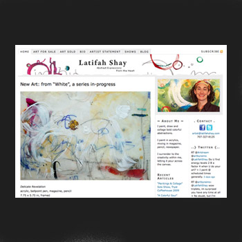
As soon as I arrive at Latifah’s home page I realize that something special has happened – I’ve stumbled across a whole world of experience and I feel excited. I want to explore and find out more.
A number of things contributed to that – first is the fact that Latifah is a true artist. When I look at her art I feel so much more than the media or the colors or the technical skill – I feel life experience and beauty and purpose and a story. There is a whole holographic world with each one of her artworks.
The next thing is that the design of the website is so harmonious with the art – and this contributes to the feeling that I am traveling through a whole world of experience. The art births this feeling, but the website magnifies it. Having large images of the art on the homepage has impact and allows the work to have the greatest influence on the visitor.
Finally, the picture of Latifah on the right hand side of the website is always with me on every page – so I feel as though she is actually escorting me through the site just as if I was at an open studio. It creates a very personal experience which deepens my appreciation of the work.
A few practical but important observations too:
- The website loads quickly in my browser so I don’t get impatient
- The nav-bar (menu) is consistent on every page so I never feel lost
- The naming of the pages and the URL structure are very search-engine-friendly
The Gallery
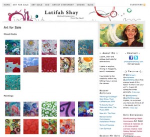
When I click through to the gallery sections of the site I’m presented with a visually compelling array of thumbnails. I feel like I’m in an expensive candy store and I’m not sure which image to pick!
But I do click through to each one and the lightbox enlargements present the work well. Personally I’m not a huge fan of the white-borders that lightbox displays typically add – but it is not a show stopper for me.
Again, having the image of Latifah with me on the gallery pages makes this more than just my own journey. The artist is with me and is guiding me along. We often say that an artist website with the right presentation and design can help you build relationships with buyers and this site is a great example of how this principle can work.
The About The Artist Sections
Latifah’s Bio and Artist Statement are crafted in a format we expect – which is good. The thing that stands out as I read them is that her experience and artistic consciousness are very much aligned with her art. Listen to her Artist Statement:
I feel such joy and freedom when I create. When I paint I am present with the
truth of who I am. I move through life enjoying, exploring and expressing this
exciting part of my being.I listen to my heart as I create, moving with what feels right. My artwork
captures but a moment of my experience of the Divine.My current work is bold and expressive, tender inside and very real. Marriage
and motherhood have fostered strength and conviction in my art.
This is actually what I feel when I look at the art. This “alignment” is a very powerful thing for any human and suggests a person who has matured into a full sense of self. You can read more on this theme in our article, “Sell Art With Authenticity”.
So again, part of what makes this website great is that the artist is ready for it!
Some practical points:
- I do like the signature on the artist statement page. It adds to the experience.
- Working with a professional writer is a great idea for these sections. A pro who understands you can often create something more authentic than you could.
The Shows Page
This page is straightforward but I want to comment on it for one reason. Latifah did a very simple but very neat thing on this page – can you see it??
Here it is: At the end of each show description she has a link to “photos”. Clicking on that link takes you through to a blog post describing that show and showing photos of the works on display. This makes the one-line show description SO MUCH MORE REAL!!
The Blog Section
I like Latifah’s blog because it is interesting, but I like it more because it shows me that she is successful! Many of her posts are about shows and commissions with nice visual imagery of the work on display. Check out Retreat Center Commission: Installation Photos and New Art: The DaSilva Commission Installed.
Why is this important? Because as a prospective buyer I get really interested when (1) I like your work, and (2) I see that other people also like it and buy it.
There is an old saying that “Much gathers more…. and loss leads to greater loss”, so sharing successful moments is important to build your career and Latifah’s blog does this well.
Conclusion
The things that make Latifah’s website work so well for me are great art, good design and presentation, a positive upbeat successful vibe, and authenticity. As a visitor, after spending a few minutes on her website I am thinking:
- I really want to go to a showing of her work
- I’d love to talk with Latifah and find out more about her work and artistic vision
- I’m really thinking I will want to buy something – maybe I could commission a piece for my home?
I can tell you from experience – if your artist website can do that for you, it just doesn’t get any better!
Latifah is a designer and an artist – and it shines through in her website. Not every artist is a designer though – so if you’re ready for a new site please check out our new Art Marketing Machines at Espresso Artist Websites. Payment plans are available!


Great artist website. I mentionned your post in my blog review
It is a great site! Love the fact she used WordPress for it. there is so much that can be done with WP…
Cheers
Moshe
Good point Moshe. I forgot to mention the fact that Latifah's site is based on WordPress.
This really is a powerful foundation for any artist website – in fact most of our websites over at Espresso Artist Websites (http://www.EspressoArtistwebsites.com) are our own custom themes built on WordPress engines. Why? Because it provides such a powerful SEO-optimized basis and there is a huge development community constantly developing new add-ons for WP. Also, it is your OWN website so you are not constrained by the structure of a portfolio service.
In Latifah's case she did a very nice job of customizing an existing Thesis theme with excellent results.
Daniel.