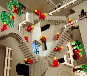
In one of the earlier Harry Potter films (I think it was “Goblet Of Fire”) there was a competition in which the contestants had to find their way out of a deadly maze. At first the maze looked innocent enough but it quickly took on a very sinister character and ultimately threatened their very lives.
That’s how I feel sometimes when I am finding my way through some artist’s websites. Often I start out in a jubilant mood – the art looks interesting and the website showcases it quite well but then I realize that I am – in a word – LOST! Maybe you think my “life threatening” analogy above is a bit melodramatic but the simple fact is that when a visitor gets lost in your website they usually escape by closing the browser window – probably never to return. If that visitor was a serious potential buyer or gallery or collector – you might have just lost a good sale opportunity.
As artists, we often tend to focus on the importance of the purely visual aspects of a website design – because we are visual people. But any experienced online business will tell you that two of the big keys to success lie in the sciences of “Navigation” and “Information Design”. Information Design is a fairly sophisticated art which encourages visitors to follow specific pathways through a website. Navigation is far simpler – it simply tries to avoid a visitor getting lost!
Artist’s websites tend to be fairly simple in their content so today we are focusing on the problem of “Poor Navigation”.
Poor navigation shows up in a variety of ways. One that I experienced just this morning was as follows: I visited the home page of an artist’s website – it looked great – stunning central image, simple design, not distracting, nice navigation menu on the left hand side of the page. Looking good – until I clicked through to the gallery. The images were beautiful but the problem was that there was no way to get out of the gallery when I was finished except to click on my browser “back” button to get to the home page. Then I clicked through to the “about” section and found the same problem when I tried to leave there. Don’t expect your visitors to have this much patience!
The problem in the above website was quite simple – the nav bar (menu) was only present on the home page. A simple solution would be to add it to every page on the site.
Yesterday I experienced a different navigation problem – This artist had a truly beautiful website and I was having a wonderful time until I clicked on a thumbnail image in their gallery. It opened into a beautiful lightbox display which took up the entire window – the art was big and beautifully showcased. But then I found that I couldn’t get back to the main website because there was no way to close the lightbox display. So I had to close the browser and start again. A few tries later I accidentally found that when I clicked on the lightbox display it would close the image and return me to the website. Again – don’t count on visitors having the patience to figure that out.
The solution to this navigation problem was again very simple – add a “close” link to the bottom of the lightbox display window.
The final example of problem navigation I experienced recently was with a website with a drop-down nav-bar. One of the top-menu items was “gallery” and when I clicked on it a drop-down menu opened with two choices: “Portfolio” or “Commissions”. So I thought those were my two options. But later by accident I found that it was possible to just click on the main “gallery” top menu and go to a completely different page. This was very confusing (but not life threatening as I could still escape without closing the browser).
The solution to avoiding site navigation problems is very simple – follow the KISS (Keep It Simple Stupid!) principle. In a nutshell that means:
- Have a nav-bar (menu) on your website
- Put the same nav-bar on every page of your website
- Put the nav bar in the same place in every page (i.e. avoid having it on the top of the page on some sections and the side of the page on other sections)
- Make sure that all image pop-ups or light-box displays have an obvious “close” link or symbol
- Avoid too much complexity with drop-down menu structure – make sure ALL the available choices are obvious
- Test your website’s usability – ask a few (honest!) friends to visit your site and look for places they get “lost”
- Remember that “Simple Is Beautiful” in website navigation!
Follow these simple guidelines and you’ll find that visitors are spending more time enjoying your website and reviewing more of your pages. This ultimately leads to better engagement and much more effective art marketing!
We hope you enjoyed today’s article and welcome your comments and thoughts below. You can now read the next article in this series, “Big Artist Website Mistake #3”!


your final example of problem navigation describes my blog template setup like under artist or market place. i have been thinking about it again and again but not sure what is best. would it be best to leave the main menu page blank and add that content as a sub page?
Udaysree,
I think it's fine because you maintain the identical menu structure on each page (at least that is how it looks on a quick visit). I didn't find it too confusing!
Daniel.