 In yesterday’s article we promised you the big-5 list of art website bloopers to avoid at all cost with your artist website. Today we are counting down starting with Mistake #5 – Missing or Poor Quality Bio.
Let me tell you what happens when most interested visitors or arts professionals visit your website. There’s a very fast and almost-subconscious judgement of the art and the artist that takes place in the first 30-60 seconds that goes like this:
Does the art on the home page get my attention?
- If no, leave immediately
- If yes, look at gallery section.
Does a quick look at the art in the gallery show consistency and talent?
- If no, leave immediately
- If yes, find out more about the artist = go to “about artist” section
Is there an interesting artist bio and can I see what they look like?
- If no, leave immediately
- If yes, continue to further review of work in galleries and resume
You might have romantic notions that the art should speak for itself – but it probably won’t! Be real – you’re an emerging artist and you need all your marketing guns blazing to get the kind of attention you will need to be successful. If a gallery or collector – or even a print buyer gets interested in your art, they are buying into the art and into you and your story. So make it a good story.
And just to be crystal clear – we’re talking about your bio here, not your artist statement. That’s also very important but is a topic for another day.
Your good story needs to be engaging. Everyone has a great story inside – so bring it out and write it down so we can all understand more about you. If you find this challenging, try working with friend or family member to loosen things up. Often it helps if they interview you and ask you questions about your life – then you can build your story from the answers.
The important question your bio needs to answer is simply, “What was the journey that led this person to create this amazing art – and where are they heading now?” That’s it! We don’t need to hear every detail of your life – just the answer to that question.
Please include a photo of yourself – one that shows the artist. It should look professional but still retain the individuality and creativity that says, “This is an artist”. When I review an artist’s website the photo of the artist is one of the things I most look forward to. Why – because when I see them and read their story I start to understand their journey – and that helps me to appreciate their art.
Examples of Good Art Bios
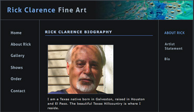
We recently asked Rick Clarence to update his bio for our Featured Artist article as his earlier version was just a couple of sentences and really didn’t do justice to his talent. Rick doesn’t like to make a lot of noise about his talents so his wife and daughters interviewed him and wrote the bio. We think the result is very effective:
Rick is a very private, family oriented man. He lives in South Central Austin, Texas where every day thinking out of the box is the norm. Using Texas as home-base, he has traveled much of the USA, Western Europe, the Caribean, Mexico and Central America. On each trip he has made new friends, enjoyed the art, fishing, and cuisine, and the sharing of the experience with family and extended family.
On these adventures Rick’s dreams are stimulated and a creative recharge takes place – and this is usually followed by prolific painting.
Rick has an American bulldog named Lulu Belle who accompanies him to the Pedernales River to run, kayak, fish, swim, hike, and to reflect on the life and death that surrounds the canyon lands. This is his refuge and main creative source.
Rich is also a master gardener, gourmet chef, and has a sense of humor much enjoyed by his family and friends.
Don’t you get a flavor of the artist from that bio?
Artist Kazuki Takizawa has a different style to his bio – one which suits his age and the stage he is at in his art career:
Born and raised in the urban setting of Hong Kong and attending high school in Bangkok, Thailand gave Kazuki Takizawa an appreciation for nature from an early age. His work and process reflects the concept of order from chaos, and is influenced by the aesthetics of the natural world.
Kazuki graduated from the University of Hawaii at Manoa with a Bachelor of Fine Arts degree in glass art. His work has been exhibited in numerous exhibitions locally and nationally. He was the teacher’s assistant for Shunji Omura’s glass workshop held at the University of Hawaii at Manoa in 2007. He received scholarships to attend Pilchuck Glass School and Glass Art Society Conference in 2008. He is currently working as a glassblowing assistant for a local artist.
Kazuki’s bio is simple, clean, and very much in harmony with the style of his work.
We hope that you enjoyed this article and welcome your comments! You can now read the next installment in this series: “Big Artist Website Mistake #4”.


Hm. I'm not sure if I agree with this, at least not completely. It may simply be my own bias, but I am several times more likely to remember the art work rather than the artist– in fact, whether I find work via a website or browsing at an art fair, the likelihood is that I won't remember the artist's name at all, but rather "oh, it was the guy who painted still lifes with apples staged in a war." It's nothing personal against the artists, of course, I'm just really terrible at names, and much better at remembering images.
To that extent, an artist bio is not going to do much for me one way or another. I will pay attention to an artist's background only if I am truly impressed by their work… and in that case, I'd rather see if they have a blog where I can follow them more closely, rather than just a small bio.
A picture is worth 1000 words?
I agree that a good bio is important, but at the end of the day it is the combination of everything. The artist's blog has much more space (both in characters and in time) to tell the story, one bit at a time, but the bio should give the first impression, aerial glimpse, to entice for more.
One thing I wondered is regarding the education/exhibits/awards/achievements etc. Is that part of the bio or does it require its own section?
Good comments Viridis and Moche.
It's useful to think of a good artist website as the result of a great recipe – the "combination of everything" as Moche so nicely described it. Ideally you are trying to bake a cake which will appeal to the largest body of potential arts buyers and professionals. If you're missing an ingredient the cake might still turn out OK – but the taste might not appeal to a whole segment of potential buyers.
So – why would you do that when you don't have to?
I understand Viridis that some art buyers don't focus on the artist – but many do – so don't exclude them!
Your point about a blog being a better place to understand the artist and their story is very true – I think artist blogs when well-done are tremendous.
But think of the bio page as being the "30 second elevator pitch" which gets the attention – while the blog is the bigger picture for a visitor who is ready for more.
Moche – your question about where education/exhibits/awards/achievements should go. Traditionally they would go into a separate section and be called the "Artist Resume". Some artists combine them with a bio but I personally think it's better to keep them separate. you will get different viewpoints on that question for sure.
Thanks again for the comments.
I like the Rick Clarence bio in the picture. Its kind of like mine. If I write anything more than that I feel like I'm spewing out boring garbage that no one wants to read.
Thanks Daniel,
In my site I have my education/exhibits/awards/achievements in the same bio page, mainly because I am just starting, and so its not so long or big…. Any recommandations for that?
Thanks
Moshe
Moshe,
I think that's just fine to have it on the same page for now. It's always a challenge to build a resume and I think combining it in the bio is a good idea to get started. Much better than a resume that has only a couple of lines! …. Daniel.
Thanks for these excellent examples. I wasn't planning on re-writing my bio, but not you've got me thinking…
Excellent blog on creating a compelling artist biography. It is extremely important to share a bit of your personal experiences or the story of how you came to be an artist, what inspires you to create and where that takes you.
People who by art want to know about the artist so that they can relate to them on a personal level. When you aren't selling your work 'Face-to-Face' with your customers, your artist biography is the best online solution.
By telling the readers exactly what question they need to answer in their biography, you are setting them a step above the rest.
Thanks for a great post.