 In our work developing artist websites at Beautiful Artist Websites we often notice that artists make mistakes with their sites because they don’t stand back and see the big picture of what is really needed to promote their work.
As an example, it is quite common to see artists fixate on intricate details of a logo or an image size or placement while at the same time missing the fact that their bio or resume or gallery is missing important information or essential features.
With that in mind, here are a few simple questions to get you focused on what you really need in your website.
- What is the main purpose of your artist website? e.g. online brochure, sell art online, build community with artists/buyers, etc
- What is the target audience you are trying to impress with your artist website? (e.g. art galleries, collectors, consumers, decorators, children, families, etc). You may have more than one.
- Put yourself in the shoes of your target audience(s) for a moment. What would be the most important information and qualities THEY would want to find in your website? Think about content and presentation. (Remember to step outside your own thought process with this question)
- Given the market(s) you have identified, what would be the ways that you would connect with them and tell them about your website and your work AND follow up with them? List the most likely strategies for your market. Some options might be: mail-outs (snail mail), advertising in specialty publications (online and offline), personal networking (visits to art events and phonecalls), open studios, Social Networking (Facebook, Twitter, etc), Email Marketing.
- Artist websites need to fit into an overall art marketing plan. Do you have one (an art marketing plan) and how will your website fit?
- Given the markets(s) you have identified for your art, how would they actually buy your art? e.g. Through galleries, art fairs, art representatives, gift stores, decorators, direct from your studio, over the phone, online sale using your website.
- What is the price-range for your work? (Include originals and reproductions)
- Is it important for your website to have online sales capability? (Bear in mind that buyers are fairly unlikely to buy online for sales over $500 – unless they are existing clients). Depending on your work and your market and your strategy you may prefer to sell work through specialist art-sales sites like Zazzle or Yessy while focusing your own site on information, presentation, and marketing.
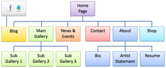
- What would be a good structure? Given your answers to all of the above questions and referencing our Artist Websites generic structure diagram below, sketch out a possible structure for your artist website.
There is still a lot more work to do before your artist website is live and selling. But starting first with these essential questions will get you moving in the right direction – because they are focusing on what the market is asking of you rather than your internal ideas alone.
We will have a follow-on set of questions for you soon focusing in on the more detailed design aspects of artist websites. Enjoy!


Always interesting blogs and info that gives me an insight on what occupies your makteting attention.
Suggestion about structure of the post today: It was hard for a viewer t soee wheer to go to see the full post. There were two or three alternative posts listed before the "read more" signal. i missed that sign twice, because a lot of info was below the fold on a laptop screen.
No pictures showed up except in the html version.
Forgive me for noticing how dispassionate the post was. Is it exciting or not?
Like the overall impression of the blog … which has been very helpful. Tah.
Neil
Thanks
sorry about the typos…the screen here is so tiny!! excuse
Jeez Neil – Didn't you realize that this site is an Australian-free zone! Just kidding – As many of our readers realize I too originate from Down-under land 🙂
Thanks for the heads up – I guess you are referring to the email update?? We will fix that problem.
You cracked me up with, "Forgive me for noticing how dispassionate the post was. Is it exciting or not?"
"Crikey!", I thought to myself. Translation of "crikey" for non-aussies could be, "Yikes!".
Note: another good aussie term which readers will enjoy is, "Strike me pink", which means pretty much what it says – and similar to "crikey".
Anyway – enough Australian cultural training for now! We really do try to be inspirational and a little opinionated with a lot of our posts but sometimes it is important to crunch out the basic facts as well. Today's was one of the fact-crunching kind.
Thanks again for the input.
Daniel.