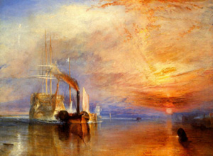
The Fighting Temeraire - William Turner 1838 (An example of a great image)
This last article in our “Big Artist Website Mistake” series is short and sweet but also incredibly important to your online marketing success.We believe it to be the most important success/fail factor with any artist’s website.
There’s an old saying – “Garbage in, garbage out”. Nothing could describe more graphically the effect of poor quality images on your artist website. Don’t confuse what we are saying here. I am in no way suggesting that your art is poor. What I am referring to is the quality of the photography, lighting, digital conversion, and color-correction that was used to capture and display the images for use on your website.
I regularly review art websites where I suspect that the art is good but the images I am actually looking at are far from that. It leaves me feeling unsatisfied and I typically leave and move on to review a different artist’s site.
Some of the biggest problem factors with images are:
- Poor Focus – I can’t see the image detail clearly
- Too Small – The image is too small to be able to “feel” it
- Poor Lighting – The image looks dull and lifeless
- Poor Color Adjustment – This is one that I might not actually realize when looking at your website. I would typically notice this when I buy a piece of your art and discover that the colors look quite different to what I saw on the website.
- Overpowering Website Background Color – This is not strictly an image problem but a website design problem. If the background color is too bright or uses a non-neutral color it can skew the color balance in your visitor’s brain so that the image they see looks quite different to the one you think they are looking at.
Here are some guidelines for working successfully with images on your art website:
- We recommend that you have your art lit and photographed in a studio by a professional with a background of experience in photographing fine art. Shop around and ask for recommendations as not all photographers do this well. Sure it will cost you a few dollars but what is your art worth?
- If you can’t or don’t want to engage a professional be sure to study up on how to photograph art. There are a number of great books on this topic including one we recommend, “How To Photograph Works Of Art”, by Sheldan Collins. You will probably need to make some investments in lighting and possibly a good camera so this route may not necessarily be cheaper than using a professional.
- Photograph the art using a very high image quality setting. We normally request that clients send us high quality jpeg or RAW files with a minimum resolution of 5″ x 7″ @ 300 dpi (or equivalent). This provides a nice large image to work with and gives the designer room to move with image sizing and adjustment.
- At the time you have your art photographed we recommend that, in addition to the digital images, you also shoot 35mm slides of the work. This is important for use as a visual reference when adjusting the images for use on the website. If you only send the digital files to a website designer, how will they know the color details of what the art actually looked like?
- Make sure that your website designer (or you if you are working on your own site) is experienced with showcasing art. In particular, ensure that they are experienced with adjusting images to look like the original works of art (color balancing, contrast, etc). If not, you need to learn or find another designer.
- The design of the website should allow for a large high-quality image of each artwork to be viewed. Don’t limit your visitor’s enjoyment of your work by offering images they can’t see.
Follow these guidelines and you’ll be light-years ahead of the pack with the most important aspect of your online art presence – rather than “Garbage in, garbage out”, you’ll experience, “Excellence In, Excellence Out”! Thanks for joining us in this 5-part series. As always we welcome your comments.


These article have been great Daniel and for sure this last one drives the point home. I have experienced this quite often in artists websites I have visited. I am a graphite artist. You would think this would be quite simple. You know, black and white. I couldn't begin to tell you how much I have wrestled with lighting, white balance and focus. I have a really good camera and these are continuing issues. This is a great reminder of how truly important this is. Stay after it guys. Thanks for all of the excellent info.
Brian Parker
Sound advice. My only objection is your #4– color quality of digital images is definitely a concern on different monitors…but does anybody still use slides? Really? What website designer nowadays even has a slide projector? I can't even recall seeing slide projectors any more recently than maybe four or five years ago; everybody seems to have switched to projectors that can hook up directly to a laptop. I've seen people occasionally ask for color print-outs of a piece, but slides seem like one of those things that if they're not obsolete already, they will be very soon.
Brian,
Thanks a lot for that very generous comment. we put a lot of effort into these articles and we really appreciate positive feedback! I totally understand the white balance and focus issues with your work. We were recently helping a client obtain some product shots of white gift boxes – and the white balancing was ridiculously difficult!
Viridis,
You make a good point about the slides. However at this time it's still quite possible to obtain slide film and as long as it is available we will always prefer to have a slide image to use as a visual reference for the color balancing. So – we still use them!
As far as projectors go – what you say is very true – I'm not sure you can buy a new 35mm slide projector these days. However we never used a projector – we always look at the slides on a small viewer and these are still available (or at least they were about 6 months ago – haven't checked recently). It's true that all screens are different but that doesn't excuse ignoring color balancing.
Thank you both for your comments.
Daniel.